Landing Page Testing: 12 Tests to Run Right Now
Is the landing page the most important element of your entire AdWords campaign?
After all, it’s the last step of the customer journey. It’s the place where people are going to decide, once and for all, whether to buy from you.
Every element of your landing page has the potential to make or break conversions. That’s why it’s important to run tests, to fine tune things and ensure that everything’s working like it should.
This post is about landing page testing and optimisation. We’ll look at 12 tests you should run right now to make your landing pages more effective.
How to run landing page tests for AdWords
We call it split testing, or A/B testing. Essentially, you run two versions of a landing page at the same time, each one slightly different.
They might use different images, for example. Or one might have a contact form at the top of the page, the other at the bottom.
Everything about the rest of the PPC campaign stays the same – the keywords, the ads – but the traffic is split between these two landing pages. In this way, you can directly compare the results. Which was the most effective at driving conversions?
You can do landing page testing manually by simply duplicating a set of ads, sending one set to landing page A and one set to landing page B.
Alternatively, there’s plenty of tools out there designed to make landing page testing as easy as possible. Some of them are free!
If you’re new to the world of landing page testing, consider starting with Google’s own testing platform.
Landing page testing – one very important thing to get right!
When running landing page tests, you should only change one thing at a time.
It might sound obvious, but you’d be amazed by how many people get this wrong!
If you only change one element at a time, you’ll be able to attribute any shift in customer behaviour to that change.
But if you change multiple elements at a time – say, you run with a different picture and a different headline – then how will you know which change was the more effective?
Now let’s take a look at 12 tests you should run right now to optimise your landing pages.
Images
Images are an important element of landing pages. Apart from making your pages more visually striking, images can be used to sell a lifestyle or to show off your brand identity.
So you need images. But what sort of images? A drawing or a photo? A big clear picture of the product you’re trying to sell or a picture of someone using that product?
You may find that images featuring people are more effective at driving conversions, but even then, which photos of which people? Will an image of a single person work better than an image of a group of people? Is it best if they’re looking into the camera or slightly off-camera? Should you run with an image of a man or a woman? An adult or a child?
You get the idea. The more images you have to work with, the better understanding you’ll gain of what sort of image clicks with your customers.
You might, to your surprise, find that it’s best to run with no images. In this test, Unbounce found that a page without an image had 24% more submissions than a page with an image.
They described this result as “shocking”.
Which just goes to show how important it is to test! You never know what you’ll find.
Headlines
The headline on your landing page has a lot of work to do! It needs to be relevant to the ads you’re running, as this will help improve your Quality Score while giving your users a more coherent and streamlined experience.
But at the same time, your headline must instantly communicate your brand values and the benefits you’re offering, all while reassuring potential customers that they’ve come to the right place.
No pressure!
This is why it pays to test your headlines. You can experiment with different wordings and different messages, as well as certain stylistic elements, like font size and colour.
Again, what you find with your tests may surprise you. Unbounce ran a page with a clear headline and clear sales copy against one that was slightly less compelling. They found that the latter increased leads by 115%. Why? Because the text was more in line with the text visitors had seen on the PPC ads they’d clicked!
Copy
Entire books have been written about writing the perfect copy for optimising conversions. This stuff matters, and split testing can help you get things just right.
There’s many tests you can run here. Length, for instance, how much information do your customers need? Will a few brief paragraphs do or will they need a lot more information to help them make up their minds?
Also – which benefits should you focus on? What sort of tone should you use?
Will humour work? Or should you keep things professional?
If there are multiple words for describing what you sell, which words will strike a chord with your customers?
Form Layout
If you’re using forms to collect leads, it pays to test the form layout.
How much information do you really need from your customers?
Do you really need to ask for their names, email addresses, places of work and their phone numbers?
Or can you get by with just their email address?
The fewer fields there are to fill in, then the more likely people are to fill in forms. But with landing page testing, you can find out if this is true.
Maybe you’ll learn that your leads are quite happy to tell you everything!
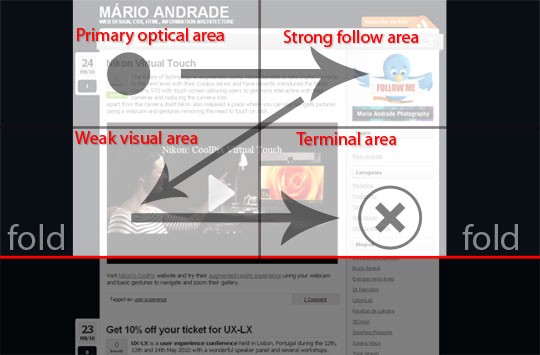
You’ll also want to consider how you layout the information too. Reading patterns can help you place the right information in the right places.
Medium explores the Gutenberg diagram and how it can be used by web designers to improve conversions with their diagram below.
But you never know unless you test.
Form Placement
Where should you put that form on your page?
Maybe if it’s the first thing your potential leads see they’ll be more likely to fill it in.
Or maybe the page will be more successful if people must first scroll through some persuasive promotional copy before they see your form.
Or maybe you’ll find that your page works best with no form at all. In which case, there’s a whole load of tests you can run with your call to action (CTA) buttons.
Speaking of which!
CTA buttons – Colour, shape, placement
Whether you’re selling products or collecting leads, it’s likely your landing page will feature at least one CTA button.
There’s many tests you can run here. What sort of button are your customers more likely to click? A square one or one with rounded corners? A red one or a green one? A flat one or one that uses shading to appear 3D?
And where should you put your CTA button? At the top of the page or the bottom? Or both?
Case in point – this Kissmetrics blog discusses how, in one case, moving the CTA button to the bottom of the page resulted in 304% more conversions.
CTA buttons – Text
Perhaps even more important than the colour, shape and placement of your CTA buttons is the text – the actual call to action.
This is an area where a small change can make a huge difference. Here’s a case study in which changing one word resulted in 14.79% increase in conversions.
Again, we could write thousands of words concerning the best practice here. But all we’d be doing there is telling you what’s worked for other people. With split testing, you can determine what works for you.
What will happen when people click on the CTA button? If it’s going to add a product to their basket and take them to a checkout page, the words “buy now” might be enough. Or maybe simply “buy” will work better? Or maybe an image of a shopping basket will work best?
Or maybe the CTA button is going to take people to a form they need to fill in. Which words will work best for encouraging people to take that step? “Learn more” or “Get in touch”? There’s only one way to find out!
Here’s our guide to writing good CTAs for PPC landing pages. It should give you a better idea of what to test here.
Colour schemes
We mentioned above that you might consider testing two different coloured CTA buttons. People might be more likely to click a red button than a green button. But that’s only half the story.
The main thing is to make the key elements of your landing page stand out.
A green button against a white background will stand out better than a green button against a green background.
So long as you get that contrast right, you can really go to town with your colour schemes.
But like with everything here, it’s worth running tests.
Your landing page might look beautiful when painted in your brand colours.
But maybe your customers will be more likely to convert if they see simple black text against a white background?
Pop-ups
It’s probably happened to you: You’re reading an article about something or other, and you eventually realise that this article probably isn’t going to give you the information you’re looking for.
So you move your mouse to click that “x” to close the tab. But the moment you do so, you get a big pop-up, urging you to sign up for a mailing list or something.
Many people find this sort of thing obtrusive and manipulative, but if you’re running a PPC campaign to gather leads or newsletter subscribers, a pop-up like this might – just might – encourage more people to submit their details.
And you won’t know for sure unless you run that test!
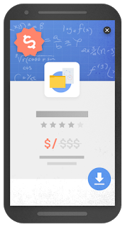
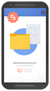
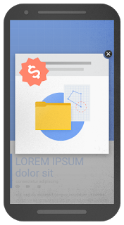
Be careful though, pop-ups on mobiles aren’t something Google are a big fan of. Google released these examples of intrusive pop ups.
Videos
A nice, tasty, well-produced video could be just the thing to convert your visitors into customers.
There’s plenty of tests you could run here. Pitch a landing page with a video against one without a video to get a good idea of the effect video content has on conversions.
Then you can experiment with the placement of the video – are people more likely to watch it if it’s at the top of the page or the bottom?
You could also test specific types of video.
Say you have one that details the various benefits of your products, and another that’s a bit more aspirational, showing off a lifestyle rather than a product. Which is best for encouraging conversions?
Run your tests and find out!
Animation
Some clever web developers like to animate certain parts of the page.
On one level this can simply make your page look flashier, more professional, and more engaging.
But you never know: these simple animations might encourage (or discourage) conversions!
For example, you could test whether visitors are more likely to click on your CTA buttons if they flash or pulse a little, to draw attention to themselves.
Navigation bars
It’s a very good idea to remove the navigation bar from your landing pages.
The fewer distractions on your landing page, the more your visitors will be able to focus on the reason they came to your landing page in the first place.
So the more likely they are to convert!
In theory!
But still.
HubSpot found that 84% of landing pages still feature navigation bars.
Is this an oversight? Or have some businesses found that navigation bars still have their place on landing pages?
It’s easy to imagine a scenario where a navigation bar might help. If you’re running an e-commerce site, for example, and visitors find that the product you’re highlighting on your landing page isn’t quite the one they’re looking for. If your navigation bar’s still there, these visitors could plausibly find what they want with ease.
Almost every study shows that removing navigation bars results in more conversions. VWO even reported a 100% rise in conversions after making this one simple change.
But as with everything else on this list, you won’t know for sure until you test!
Test your way to success!
Navigating the complexities of digital marketing can seem daunting, underscoring the value of professional guidance.
At PPC Geeks, we’re not just focused on conversions; we’re experts at optimising landing pages specifically driving sales leads. Our approach is data-driven and tailored, ensuring that every tweak and test we conduct is aimed at enhancing your landing page’s ability to attract and convert potential customers.
Get in touch to find out how we can draw from real data to optimise your landing pages.. Let us help you transform your landing pages into powerful tools for generating business.


