
How To Build the Perfect Google Ads PPC Landing Page: Best Practice and Examples
No matter how big your PPC budget, and no matter how clever your keyword and bidding strategy is, and no matter how beautifully written and relevant your ads are, if you’re not sending users to good landing pages you might as well not bother.
If your leads don’t like what they see when they reach your site, they won’t convert. You’ll have already paid for the click, but you’ll get nothing for your money.
Also, relevant landing pages can help boost your Quality Score. The better your Quality Score, the better your chances of ranking highly in the paid ad search results.
In this post we’ll explain PPC landing page best practice. Then we’ll provide an example of a good landing page from a very successful company and explore what makes it work.
PPC Landing Page Best Practice – Your Essential Guide
Before we look at some of the features common to high-converting landing pages, let’s talk briefly about what is perhaps the single most important aspect of PPC landing page best practice:
Test, test, test!
Every element of your landing page has the potential to make or break conversions. This isn’t the sort of thing you can expect to get right the first time. Instead, be prepared to test almost everything, from the text of your headlines to the colour and the shape of your CTA buttons.
One: Create a dedicated landing page for every ad you run
Good PPC is all about creating a consistent and straightforward experience for your users. Long story short – if they click on an ad for red shoes, they expect to be taken to a page about red shoes. Your landing pages must match the search intent, so it must be relevant to the keywords you’re bidding on.
There’s no point at all in simply directing your PPC traffic to your homepage. Directing traffic to the relevant product page is a better idea, but for best results you need a dedicated landing page for every ad you run.
Why? As we mentioned above, the more relevant your landing page is to the ad, the better you’re Quality Score. But beyond that – a carefully crafted landing page can be a streamlined conversion machine. You’ll have complete control over everything your visitors see and you can make it as easy as possible for them to convert.
Two: Remove all distractions
Good landing pages are focused on one product or service. A page about red shoes will just be about red shoes – it won’t also talk about black shoes.
Remove all distractions. Your standard product pages will be full of links to other areas of your site. This could confuse your visitors and every link they click could potentially take them out of the sales funnel.
A good PPC landing page may only have a couple of links to click and it should be made clear that clicking these links will allow your users to achieve what they want to achieve.
Three: Declutter
Minimalism is the order of the day. Don’t frighten visitors with reams of text. Keep things simple.
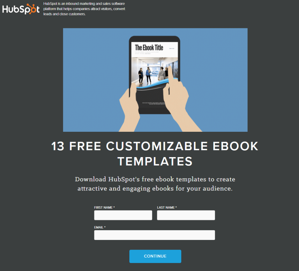
Aim for a single column layout with lots of white space. Not only will this make your landing page easier and more inviting to read, it will also enable you to use contrast to draw attention to the most important parts of the page.
Look how clean and uncluttered this landing page from Hubspot is. There’s nothing here that doesn’t serve a purpose:
Four: Make the most important elements stand out
A call to action (CTA) is a button your visitors can click to achieve their goals. Having plenty of white space on your landing page can help you to make these CTA buttons really stand out.
If they’re big, bold and blue against a white background, they’ll effortlessly draw attention to themselves. Your visitors will know exactly where they need to click to make that purchase or to get the information they’re looking for.
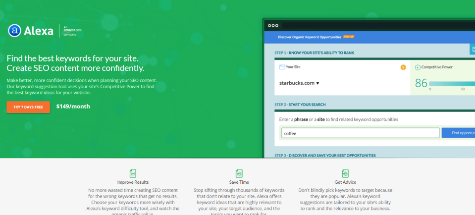
With this use of white space and contrast you can also draw attention to other important things, like testimonials and statistics.
This landing page for keyword tool Alexa makes use of contrasting colours and plenty of white space to draw attention to the CTA button and the list of benefits underneath the header:
Five: Get that CTA spot on
So your CTA button needs to stand out, but there are other ways you can increase the chances that users will click.
You need to get the colour right. Many tests have shown that green and orange buttons work best, but the main thing to bear in mind is that the colour must contrast with the rest of the landing page. A green button on a green background won’t work!
One weird trick that always seems to work – make your CTA button look like a button. Add a shading or highlights to make it look 3D, like the sort of irresistible button that you can’t help but click on.
Then there’s the text in the button. We could write thousands of words on how to get this just right, but in short, your priority is to make it as clear as possible just what they can expect to happen when they click.
Read our guide to writing CTAs for AdWords here.
Six: Invest in high quality visuals
High quality aspirational images can draw in the eye and make your landing pages look beautiful. They can put your products or services in the best possible light while subtly suggesting that your values as a business align with those of your customers.
Images involving people tend to work best. One marketing company reported a 102.5% rise in conversions once they added an image or a person.
Beware, though – many people can spot a royalty-free stock image from miles away. This might make your business look lazy, which could make potential buyers decide that they’ll take their business elsewhere.
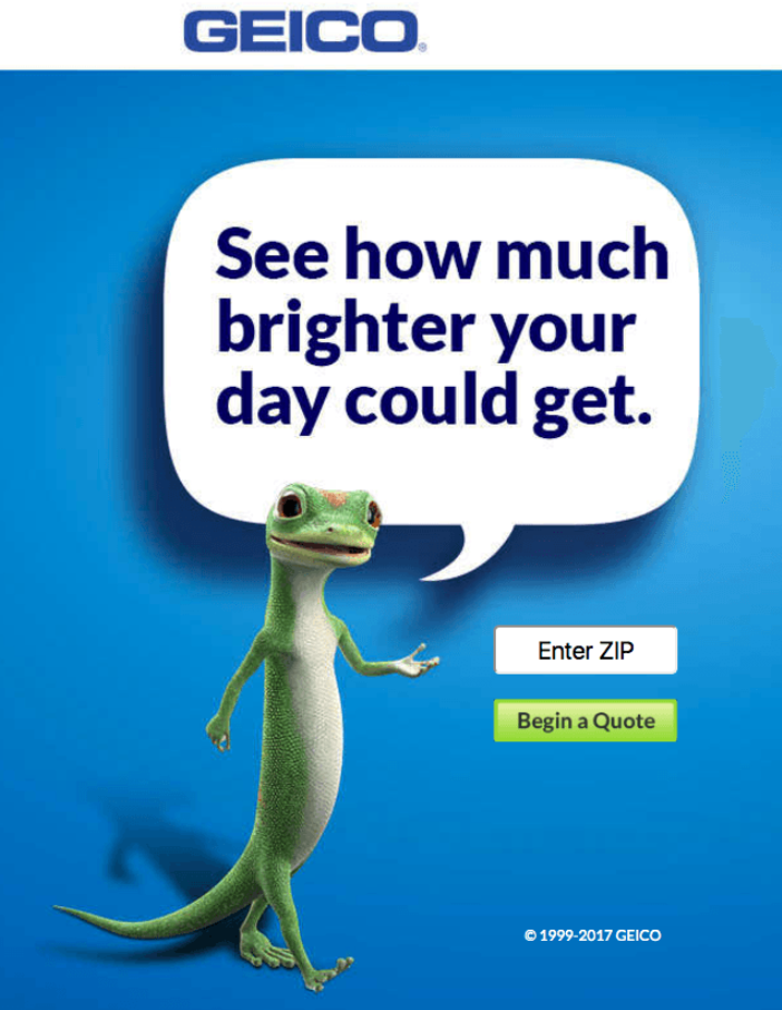
Instead, invest in high quality visuals of your own. This is one area where it pays to go all out. Get as many images as possible for each landing page and spend time testing which sort of image works best for driving conversions.
For instance, you might find that using a cute mascot works better than using images of people:
While we’re on the subject of visuals, many PPC landing pages make use of videos. These can act as more detailed product descriptions or they can provide a means of showing testimonials from satisfied customers.
Seven: Make every word count
Images are a vital part of any good PPC landing page, but that doesn’t mean you should do away entirely with text. You just need to ensure that you keep the text to a minimum and that you make every word count.
Bold headlines with brief paragraphs underneath will work better than big blocks of text. Use bullet points to break up paragraphs and to communicate benefits in bite-sized chunks. Things like testimonials, case studies, online reviews and awards work as valuable trust signals.
The first headline is the most crucial bit to get right. Think of it as a value proposition, as a positioning statement that sells a lifestyle rather than a product.
Look at the headline ride-sharing specialists Uber use:
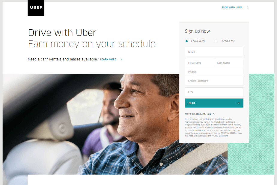
“Earn money on your schedule.” Straight to the point with no messing about. You’re not just going to make money with Uber, you’re going to make money on your own terms. This headline works in conjunction with the image of the smiling man beneath. It’s possible to read into his face not just satisfaction, but also resilience and independence.
Eight: Get the layout right
How is the perfect PPC landing page structured?
According to New York Times Bestselling author Neil Patel, the perfect landing page might look a little something like this:
- Headline
- Subheading
- Image
- Video
- Brief bit of copy
- CTA
- Trust signals – reviews, awards, case studies etc.
- Brief explanation of the product or service
- Brief exploration of the benefits
- Testimonials
- CTA
Not every successful landing page is structured in this way, but it’s a good template to follow. It’s a nice logical flow of information that’s been shown to help prospects move through the sales funnel towards that all-important conversion.
Below we’ll explore a PPC landing page that we feel is doing things right. Compare it to the template above and you’ll see that it’s structured in essentially the same way.
Example of a Good PPC Landing Pages – Airbnb
Airbnb is a company that lets you make money through temporarily letting your property. We’re going to take a close look at the landing page designed to convince people to sign up their properties for letting.
Please note – we don’t have access to the analytics for this page! We can’t say for sure that this is an effective landing page. However, Airbnb is a successful business that must be doing something right. And as this page ticks many – if not all – of the features we’ve outlined above, there’s every reason to suppose that this landing page will do the job.
Collaborating with a Google Ads specialist agency grants businesses access to a dedicated team proficient in leveraging Google’s advertising platform to drive targeted traffic and conversions.
The first thing you see is this big image. It’s simultaneously engrossing, eye-catching and aspirational. It’s selling a lifestyle, rather than a product. And as it features people, it’s relatable – that could be you welcoming friendly travellers to your home.
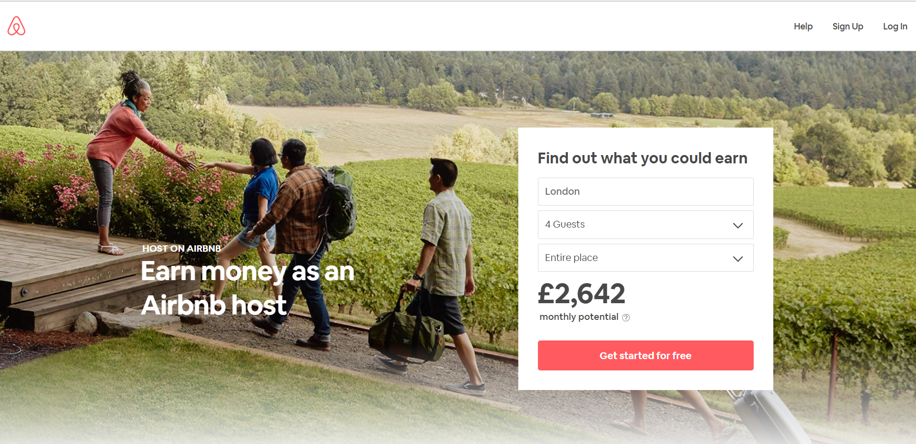
The headline: “Earn money as an Airbnb host”. It’s clear and direct. In a matter of seconds you know what the major benefit is of hosting on Airbnb. You get to make money. How much money? Handily, you can get a quote that’s unique for you without leaving the landing page by filling in that simple form to the right. Within seconds you have a figure to work with – and what a figure!
Notice the CTA button – red against the white background. It stands out, and because of the carefully-chosen words, you know exactly what to expect from clicking on it.
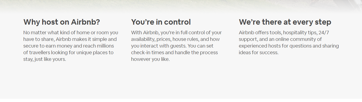
Immediately underneath this is a list of benefits beyond the amount of money you can expect to make. They’re brief paragraphs and there’s plenty of white space to make things easier to read:
As you scroll down the page something brilliant happens: That quote you’re given at the top of the page follows you. So, no matter where you are on the landing page, you’re always reminded of just how much you can expect to make. The CTA button follows you too, so getting started is always but a click away:
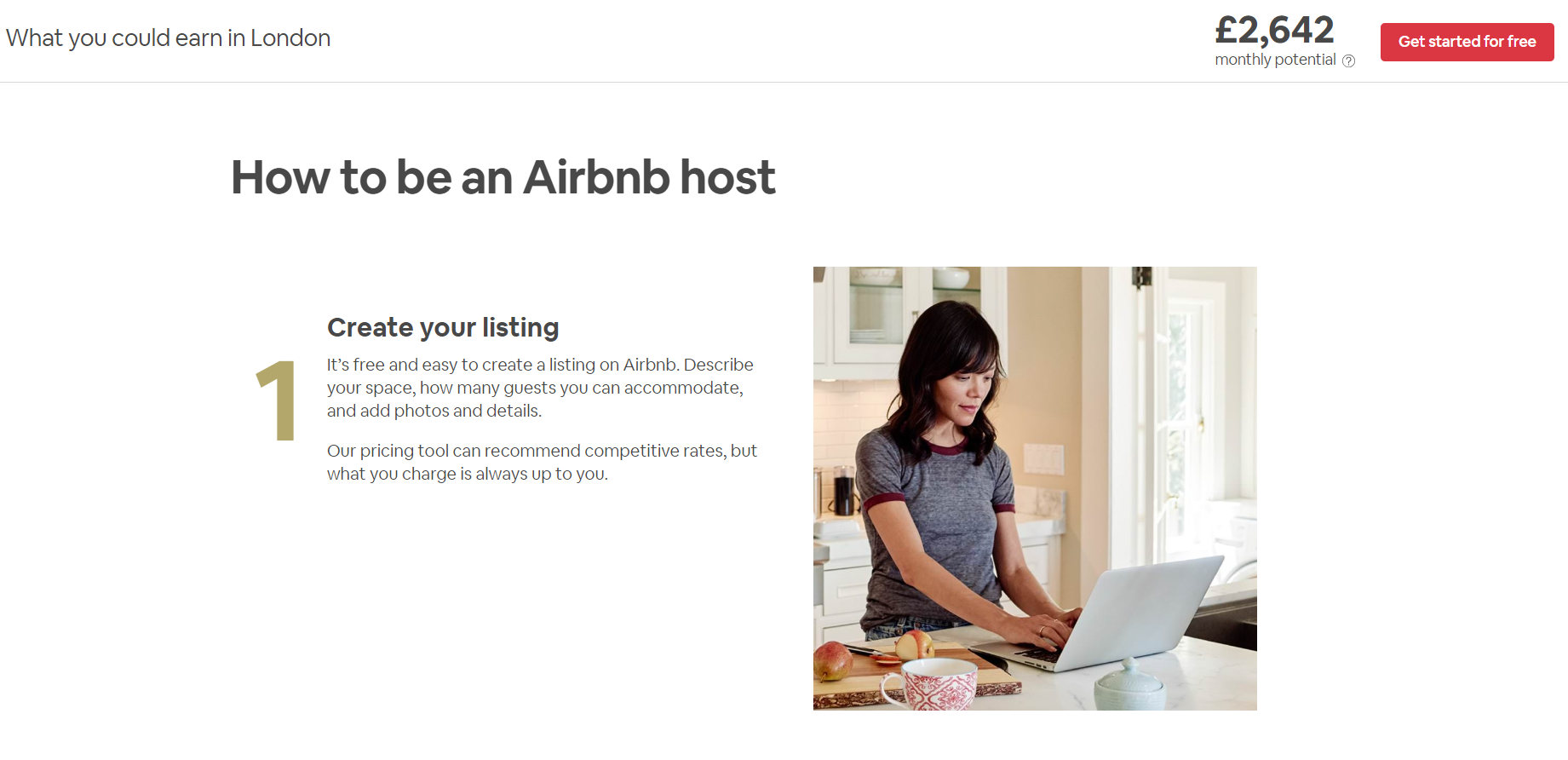
So we move through a section that talks you through the sign-up process. These may work as trust signals – they’re trying to demonstrate just how easy the process is. Again, there’s lots of white space and lots of high quality images featuring people. Text is kept to a minimum and every word counts. There’s no waffle here, you’re only told what you need to know.
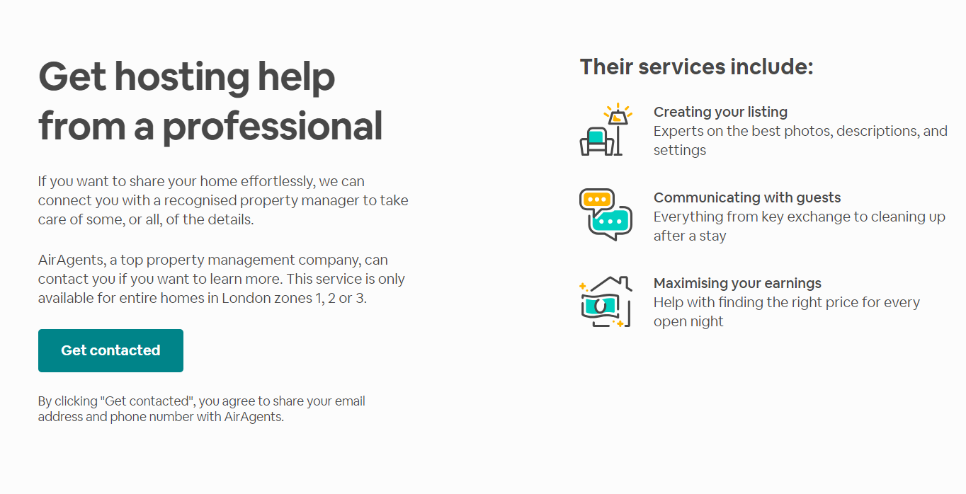
Next comes another CTA, which itself works as another trust signal. You’re given the offer of getting hosting help from a professional. Notice how it’s all benefit-lead and look how that CTA button stands out:
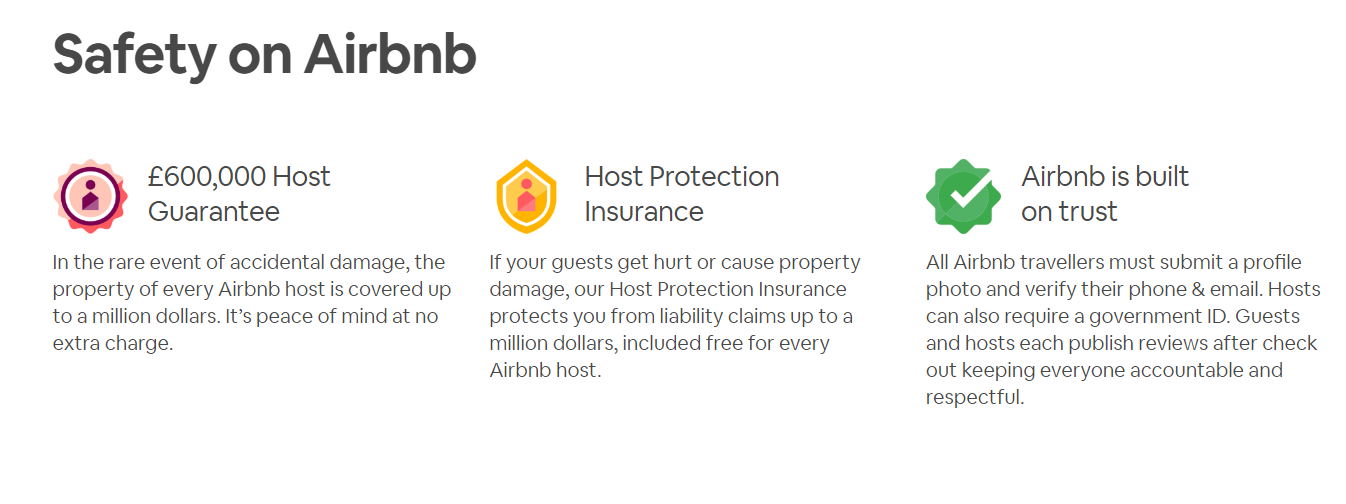
Next comes three further trust signals:
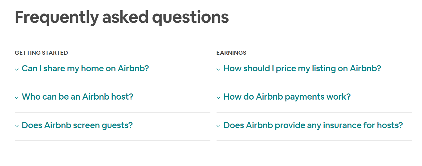
And then comes an FAQ. Clicking on each of these questions reveals the answers without taking you off the landing page:
Finally there’s a second CTA. Like the one at the top of the page, it’s coupled with a striking aspirational image that invites you to imagine yourself in this role. They’re very much selling a lifestyle here.

Why is this a good landing page? Because even though Airbnb is fast becoming a household name, renting your property to strangers is still a daunting prospect for many.
As well as featuring some great examples of PPC landing page best practice in the form of the images, the CTAs, the use of white space and the contrast, this example effectively demonstrates how the flow and structure of a landing page can be used to guide your leads towards a conversion.
Every sector serves to remind you of a potential benefit of hosting while gradually removing every possible reservation you might have. Trust signals are provided at strategic points, and you’re never allowed to forget your key motivation for considering this in the first place – the amount of money you, personally, could expect to make.
This is a great PPC landing page because it effectively sells something that many might have thought of as inconceivable and it does so by portraying it as a low-risk desirable lifestyle choice rather than a purely financial decision.
Want to craft the perfect PPC landing page for your business?
The best PPC landing page for your business might not look like this. If you’re selling a simple product or a more everyday service then it won’t have to be so lengthy or sophisticated. But what we hope this example shows is that by following certain best-practice guidelines, a good PPC landing page can be used to help almost any business get more conversions.
Want expert advice on how to create the perfect PPC landing page for your ads or simply have queries such as: What is an example of PPC?
Get in touch with one of our Google AdWords Specialists today.